Statistical Thinking using Randomisation and Simulation
Compiling data for problem solving
Di Cook (dicook@monash.edu, @visnut)
W11.C1
Overview of this class
- Working with text
- Web scraping
- Grammar of graphics
- Randomisation to assess structure perceived in plots
Simple web scraping
- Example: NBA salaries
- ESPN provides basketball players' salaries for the 2017-2018 season at http://espn.go.com/nba/salaries
library(XML)nba <- NULLfor (i in 1:11) { temp <- readHTMLTable( sprintf("http://espn.go.com/nba/salaries/_/page/%d",i))[[1]] nba <- rbind(nba, temp)}glimpse(nba)#> Observations: 473#> Variables: 4#> $ RK <fctr> 1, 2, 3, 4, 5, 6, 7, 8, 9, 10, RK, 11, 12, 13, 14, 15,...#> $ NAME <fctr> Stephen Curry, PG, LeBron James, SF, Paul Millsap, PF,...#> $ TEAM <fctr> Golden State Warriors, Cleveland Cavaliers, Denver Nug...#> $ SALARY <fctr> $34,382,550, $33,285,709, $31,269,231, $29,727,900, $2...Text massaging
head(nba$SALARY)# get rid of $ and , in salaries and convert to numeric:gsub("[$,]", "", head(as.character(nba$SALARY)))nba$SALARY <- as.numeric(gsub("[$,]", "", as.character(nba$SALARY)))#> [1] $34,382,550 $33,285,709 $31,269,231 $29,727,900 $29,512,900 $28,703,704#> 308 Levels: $19,332,500 $19,508,958 $19,578,455 $20,000,000 ... $895,197#> [1] "34382550" "33285709" "31269231" "29727900" "29512900" "28703704"#> Warning: NAs introduced by coercion- Where does the warning come from?
Cleaning NBA salaries data: hunting the warning
nba %>% filter(is.na(SALARY)) %>% head()#> RK NAME TEAM SALARY#> 1 RK NAME TEAM NA#> 2 RK NAME TEAM NA#> 3 RK NAME TEAM NA#> 4 RK NAME TEAM NA#> 5 RK NAME TEAM NA#> 6 RK NAME TEAM NA- We don't need these rows - delete all of them
dim(nba)nba <- nba[-which(nba$RK=="RK"),]dim(nba)#> [1] 473 4#> [1] 440 4Cleaning NBA data
- Separate names into first, last, and position
nba <- nba %>% mutate(NAME = as.character(nba$NAME)) %>% separate(NAME, c("full_name", "position"), ",") %>% separate(full_name, c("first", "last"), " ")#> RK first last position TEAM SALARY#> 1 1 Stephen Curry PG Golden State Warriors 34382550#> 2 2 LeBron James SF Cleveland Cavaliers 33285709#> 3 3 Paul Millsap PF Denver Nuggets 31269231#> 4 4 Gordon Hayward SF Boston Celtics 29727900#> 5 5 Blake Griffin PF LA Clippers 29512900#> 6 6 Kyle Lowry PG Toronto Raptors 28703704Cleaned data ...?
- Numbers might still be wrong, but now we are in a position to check for that.
ggplot(data=nba, aes(x=SALARY)) + geom_histogram()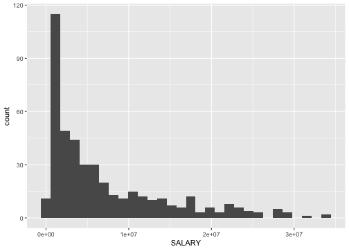
Web scraping resources
- Carson Sievert's tutorial
- Ankit Agarwal's blog post 1 ; Look for several more advanced scraping
- R Blogger's post
Tidy data and random variables
- The concept of tidy data matches elementary statistics
- Tabular form puts variables in columns and observations in rows
- Not all tabular data is in this form
- This is the point of tidy data
$$X = \left[ \begin{array}{rrrr}
           X_1 & X_2 & ... & X_p
           \end{array} \right] \\
  = \left[ \begin{array}{rrrr}
           X_{11} & X_{12} & ... & X_{1p} \\
           X_{21} & X_{22} & ... & X_{2p} \\
           \vdots & \vdots & \ddots& \vdots \\
           X_{n1} & X_{n2} & ... & X_{np}
           \end{array} \right]$$
\(X_1 \sim N(0,1), ~~X_2 \sim exp(1) ...\)
Grammar of graphics and statistics
- A statistic is a function on the values of items in a sample, e.g. for
\(n\)iid random variates\(\bar{X}_1=\sum_{i=1}^n X_{i1}\),\(s_1^2=\frac{1}{n-1}\sum_{i=1}^n(X_{i1}-\bar{X}_1)^2\) - We study the behaviour of the statistic over all possible samples of size
\(n\). - The grammar of graphics is the mapping of (random) variables to graphical elements, making plots of data into statistics
Pipeline: Messy to tidy to plot
messy_data <- read_csv("../data/tb.csv")head(messy_data)#> # A tibble: 6 x 22#> iso2 year m_04 m_514 m_014 m_1524 m_2534 m_3544 m_4554 m_5564 m_65#> <chr> <int> <int> <int> <int> <int> <int> <int> <int> <int> <int>#> 1 AD 1989 NA NA NA NA NA NA NA NA NA#> 2 AD 1990 NA NA NA NA NA NA NA NA NA#> 3 AD 1991 NA NA NA NA NA NA NA NA NA#> 4 AD 1992 NA NA NA NA NA NA NA NA NA#> 5 AD 1993 NA NA NA NA NA NA NA NA NA#> 6 AD 1994 NA NA NA NA NA NA NA NA NA#> # ... with 11 more variables: m_u <int>, f_04 <int>, f_514 <int>,#> # f_014 <int>, f_1524 <int>, f_2534 <int>, f_3544 <int>, f_4554 <int>,#> # f_5564 <int>, f_65 <int>, f_u <int>tidy_data <- messy_data %>% gather(demo, count, -year, -iso2, na.rm = TRUE) %>% separate(demo, c("gender", "age"))tidy_data <- tidy_data %>% filter(!(age %in% c("014", "04", "514", "u")))head(tidy_data)#> # A tibble: 6 x 5#> iso2 year gender age count#> <chr> <int> <chr> <chr> <int>#> 1 AD 1996 m 1524 0#> 2 AD 1997 m 1524 0#> 3 AD 1998 m 1524 0#> 4 AD 1999 m 1524 0#> 5 AD 2000 m 1524 0#> 6 AD 2002 m 1524 0100% charts
tidy_data %>% filter(iso2 == "AU") %>% ggplot(aes(x = year, y = count, fill = gender)) + geom_bar(stat = "identity", position = "fill") + facet_grid(~ age) + scale_fill_brewer(palette="Dark2")
Stacked barcharts
tidy_data %>% filter(iso2 == "AU") %>% ggplot(aes(x = year, y = count, fill = gender)) + geom_bar(stat = "identity") + facet_grid(~ age) + scale_fill_brewer(palette="Dark2") + theme( axis.text = element_text(size = 14), strip.text = element_text(size = 16), axis.title = element_text(size = 16) )
Side-by-side barcharts
tidy_data %>% filter(iso2 == "AU") %>% ggplot(aes(x = year, y = count, fill = gender)) + geom_bar(stat = "identity", position="dodge") + facet_grid(~ age) + scale_fill_brewer(palette="Dark2") + theme( axis.text = element_text(size = 14), strip.text = element_text(size = 16), axis.title = element_text(size = 16) )
facet by gender
tidy_data %>% filter(iso2 == "AU") %>% ggplot(aes(x = year, y = count, fill = gender)) + geom_bar(stat = "identity") + facet_grid(gender ~ age) + scale_fill_brewer(palette="Dark2") + theme( axis.text = element_text(size = 14), strip.text = element_text(size = 16), axis.title = element_text(size = 16) )
Rose plot
tidy_data %>% filter(iso2 == "AU") %>% ggplot(aes(x = year, y = count, fill = gender)) + geom_bar(stat = "identity") + facet_grid(gender ~ age) + scale_fill_brewer(palette="Dark2") + theme( axis.text = element_blank(), strip.text = element_text(size = 16), axis.title = element_text(size = 16) ) + coord_polar()
Rainbow charts
tidy_data %>% filter(iso2 == "AU") %>% ggplot(aes(x = 1, y = count, fill = factor(year))) + geom_bar(stat = "identity", position="fill") + facet_grid(gender ~ age) + theme( axis.text = element_blank(), strip.text = element_text(size = 16), axis.title = element_text(size = 16) )
Pie charts
tidy_data %>% filter(iso2 == "AU") %>% ggplot(aes(x = 1, y = count, fill = factor(year))) + geom_bar(stat = "identity", position="fill") + facet_grid(gender ~ age) + theme( axis.text = element_blank(), strip.text = element_text(size = 16), axis.title = element_text(size = 16) ) + coord_polar(theta="y")
Your turn
What do you learn about tb incidence in the Australia by gender and age and year from the
- 100% charts?
- stacked bar charts?
- side-by-side barcharts?
- facetted barcharts?
Summary of grammar
- The grammar is a functional language for decribing the mapping of (random) variables to plot elements.
- Its worth learning
- Original resource: Lee Wilkinson Grammar of graphics
Inference
- Choice of plot implicitly sets
\(H_0\),\(H_1\) - Generically, we are thinking
\(H_0\): no pattern,\(H_1\): pattern, but the choice of plot makes this much more explicit
Putting the pieces together
Your turn
- Question?
- Data, variables
- Mapping
- Null generating mechanism
Your turn
- Question?
- Data, variables
- Mapping
- Null generating mechanism
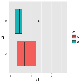
- Question? Is there a difference between the two groups?
\(H_0\): no difference,\(H_1\): difference
Your turn
- Question?
- Data, variables
- Mapping
- Null generating mechanism
- Question? Is there a difference between the two groups?
\(H_0\): no difference,\(H_1\): difference - Data, variables: Two variables: v1, v2; v2 is categorical
Your turn
- Question?
- Data, variables
- Mapping
- Null generating mechanism
- Question? Is there a difference between the two groups?
\(H_0\): no difference,\(H_1\): difference - Data, variables: Two variables: v1, v2; v2 is categorical
- Mapping: x=V2, y=V1, colour=V1, geom=boxplot
Your turn
- Question?
- Data, variables
- Mapping
- Null generating mechanism
- Question? Is there a difference between the two groups?
\(H_0\): no difference,\(H_1\): difference - Data, variables: Two variables: v1, v2; v2 is categorical
- Mapping: x=V2, y=V1, colour=V1, geom=boxplot
- Null generating mechanism: permute the values of V1, relative to V2
Clarity
- The null hypothesis is determined based on the plot type
- It is not based on the structure seen in a data set
Lineup
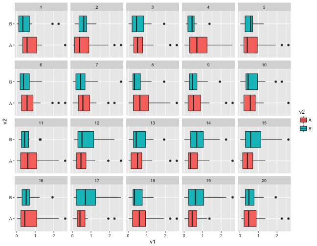
Embed the data plot in a field of null plots
Which plot shows the most difference between the groups?
Evaluation
- Computing
\(p\)-values - Power - signal strength
p-values
Suppose \(x\) individuals selected the data plot from a lineup of \(m\) plots, shown to \(K\) independent observers, then simplistically we can think about the probability of this happening, if the data plot is from the same distribution as the null plots. This yields a binomial formula:
$$P(X\geq x) = \sum_{i=x}^{K} \binom{K}{i} \left(\frac{1}{m}\right)^i\left(\frac{m-1}{m}\right)^{K-i}$$
For \(x=4, K=17, m=20\)
pvisual(4, 17, m=20)#> x simulated binom#> [1,] 4 0.021 0.008800605Simulation approach
- Scenario I: in each of K evaluations a different data set and a different set of (m-1) null plots is shown.
- Scenario II: in each of K evaluations the same data set but a different set of (m-1) null plots is shown.
- Scenario III: the same lineup, i.e. same data and same set of null plots, is shown to K different observers.
Simulation
Crucial idea: assign a p-value to each plot (data and null); under null hypothesis, this p-value is from U[0,1]
Scenario I:
- for the
\(k\)th lineup evaluation do:- pick 20
\(p\)-values from\(U[0,1]\) - for data plot compute 'strength' of other plots:
\(q = (1-p_\text{data})/\sum_j(1-p_j)\) - Use
\(q\)to determine whether data was picked in simulation:\(x_k \tilde B_{1,q}\) - repeat above three steps
\(K\)times, and find the number of data picks\(X = \sum_k x_k\)
- pick 20
- Repeat N times to get distribution of
\(X\)
Simulation
Scenario II (same data, different nulls):
- for the
\(k\)th lineup evaluation pick 20\(p\)-values from\(U[0,1]\): - for data plot compute 'strength' of other plots:
\(q = (1-p_\text{data})/\sum_j(1-p_j)\) - Use
\(q\)to determine whether data was picked in simulation:\(x_k \tilde B_{1,q}\) - find the number of data picks
\(X = \sum_k x_k\) - Repeat N times to get distribution of
\(X\)
Simulation
Scenario III (same data, same nulls):
- for the
\(k\)th lineup evaluation pick\(p_\text{data} \sim U[0,1]\):- pick 19
\(p\)-values from\(U[0,1]\) - for data plot compute 'strength' of other plots:
\(q = (1-p_\text{data})/\sum_j(1-p_j)\) - simulate number of data picks
\(X ~ B_{K, q}\)
- pick 19
- Repeat N times to get distribution of
\(X\)
Null-generating mechanisms
- Permutation: randomizing the order of one of the variables breaks association, but keeps marginal distributions the same
- Simulation: from a given distribution, or model. Assumption is that the data comes from that model
Your turn
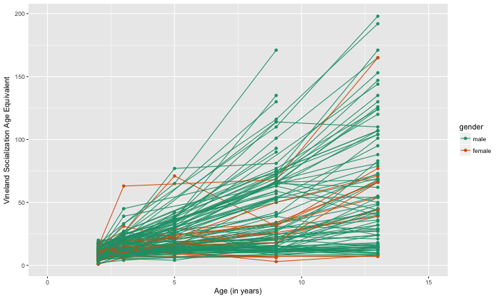
For these plot descriptions, decide on:
- null hypothesis
- null generating mechanism
Your turn
Your turn
Inference for graphics resources
- Hofmann, H., Follett, L., Majumder, M. and Cook, D. (2012) Graphical Tests for Power Comparison of Competing Designs, http://doi.ieeecomputersociety.org/10.1109/TVCG.2012.230.
- Wickham, H., Cook, D., Hofmann, H. and Buja, A. (2010) Graphical Inference for Infovis, http://doi.ieeecomputersociety.org/10.1109/TVCG.2010.161.
Principles of design
- Hierarchy of mappings: (first) position along an axis - (last) color (Cleveland, 1984; Heer and Bostock, 2009)
- Pre-attentive: Some elements are noticed before you even realise it.
- Color: (pre-attentive) palettes - qualitative, sequential, diverging.
- Proximity: Place elements for primary comparison close together.
- Change blindness: When focus is interrupted differences may not be noticed.
Hierarchy of mappings
- 1.Position - common scale (BEST)
- 2.Position - nonaligned scale
- 3.Length, direction, angle
- 4.Area
- 5.Volume, curvature
- 6.Shading, color (WORST)
Pre-attentive
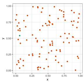
Can you find the odd one out?
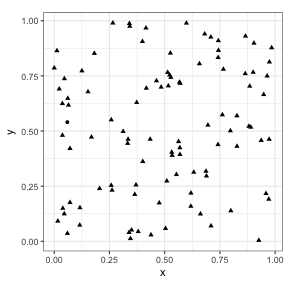
Is it easier now?
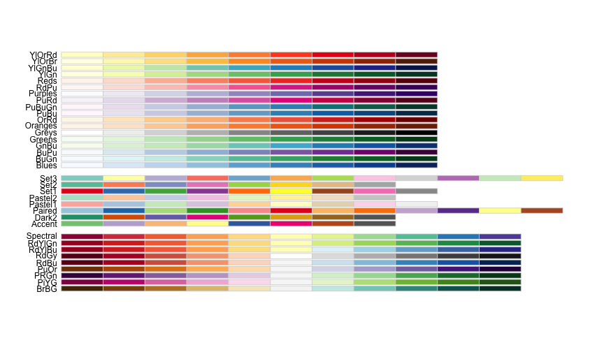
Color palettes
- Qualitative: categorical variables
- Map categorical variables, with small number of categories
- Sequential: low to high numeric values
- Numerical variables, emphasis is on the high values
- Diverging: negative to positive values
- Numerical variables, emphasis is on both top and bottom values. Only makes sense if you have positive and negative values.
Proximity
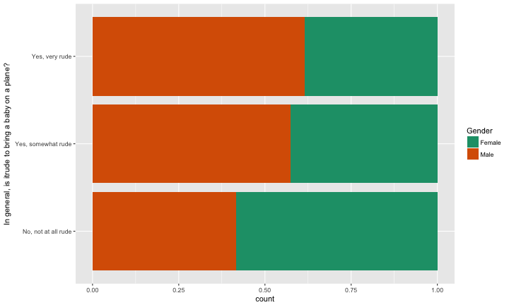
ggplot(fly_sub, aes(x=`In general, is itrude to bring a baby on a plane?`, fill=Gender)) + scale_fill_brewer(palette="Dark2") + geom_bar(position="fill") + coord_flip() + facet_wrap(~Age, ncol=5)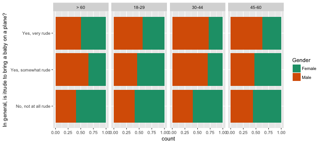
With this arrangement we can see proportion of gender across rudeness category, within age groups.
Proximity
ggplot(fly_sub, aes(x=Gender, fill=`In general, is itrude to bring a baby on a plane?`)) + geom_bar(position="fill") + coord_flip() + facet_wrap(~Age, ncol=5) + scale_fill_brewer(palette="Dark2") + theme(legend.position="bottom")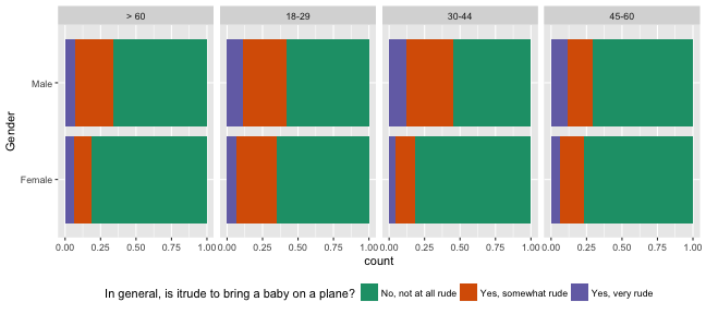
Now we can see proportion of rudeness category across gender, within age groups.
Another arrangement
ggplot(fly_sub, aes(x=Age, fill=`In general, is itrude to bring a baby on a plane?`)) + geom_bar(position="fill") + coord_flip() + facet_wrap(~Gender, ncol=5) + scale_fill_brewer(palette="Dark2") + theme(legend.position="bottom")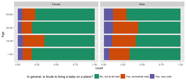 And, now we can see proportion of rudeness category across age groups, within gender.
Summary
- How you arrange the plot is a most powerful tool for making it easier for the reader to learn one thing over another.
- Making many plots, with different arrangements can be advised, and may be better than having one "perfect" plot.
- Be aware of colour blind proof palettes
- Use position along a common scale when possible for numeric variables
- Beware colour, use sparingly
Visualisation resources
- Winston Chang (2012) Cookbook for R
- ggplot2 Cheat sheet
- ggplot2: Elegant Graphics for Data Analysis, Hadley Wickham, web site
- Antony Unwin (2014) Graphical Data Analysis
- Naomi Robbins (2013) Creating More Effective Charts
- Antony Unwin, Graphical Data Analysis with R
Share and share alike

This work is licensed under a Creative Commons Attribution 4.0 International License.